Displaying Markdown Posts On Your Gatsby Site
Series:Building A Powerful Blog
Hello and welcome to the sixth post in my series on Building a Powerful Blog!🎉 If you haven't already, I would recommend going back to the first post of the series, Creating a Gatsby Blog Site, and reading through the rest of the series before continuing. By now, we've learned everything from creating your very own Gatsby site and deploying it on Netlify, all the way to creating content in Markdown files and pulling that information into your site.
Now it's time to finally get to work on the user interface of your site and learn how to display the content from your posts using your "blog-post.js" file in the templates directory. With a little bit of React components and Bootstrap, we'll transform the raw data returned from your GraphQL data layer into a beautiful UI for your readers. I hope you're as excited as I am!🥳
Displaying Your Pages
For displaying the content of your blog posts onto the page created from your "blog-post.js" template file, we'll update the return statement from the BlogPost function with a few elements and functions from react-bootstrap and gatsby-plugin-image. We've already installed gatsby-plugin-image during the creation of our site so this just leaves the installation of react-bootstrap and it's dependency, bootstrap. To get started, we need to go back to our terminal and run the below command to install the needed packages into our code base:
npm i react-bootstrap bootstrapBootstrap is a powerful and extensible front-end toolkit packed full of features and components to help you develop the UI of your site faster than before. There are several frontend toolkits out there that you can use in place of Bootstrap so feel free to utilize whichever you're most comfortable with. For the purposes of this tutorial though, I'll be using Bootstrap v5.2.
Once the package has been installed, we'll need to specifically import the minified CSS of Bootstrap in a new file titled gatsby-browser.js. This file is where Gatsby expects to find any usage of the Gatsby Browser APIs, and also allows for the customization and extension of default Gatsby settings affecting your browser, such as the CSS. Go ahead and create this file in the root of your directory, and add the following line of code before saving the file and restarting your server:
import "bootstrap/dist/css/bootstrap.min.css"With the server up and running again, navigate to your "blog-post.js" page in the templates folder and import the necessary packages at the end of your current import list. We'll only be importing the methods and components we need. As you continue forward with the updating of this file, I'll explain what each of these imports are for. With these changes, your import section should now include the following:
import React from "react"
import PropTypes from "prop-types"
import { graphql } from "gatsby"
import { Container, Row, Col } from "react-bootstrap"
import { GatsbyImage, getImage } from "gatsby-plugin-image";
From here, let's work on updating the BlogPost function and displaying the content from your blog post. To get started, remove the console.log(post), as well as the h1 element from your return statement. In it's place, add the following code:
<Container fluid className="min-vh-100 text-bg-dark">
	<Row className="justify-content-center">
		<Col md={6}>
			<h1 className="text-center">
				{post.frontmatter.title}
			</h1>
		</Col>
	</Row>
</Container>
The <Container> element will help contain, pad, and align your content within a given device or viewport. The attributes selected will make the container span the entire width and height of your viewport, as well as add a dark background and modify the text color to white.
The <Row> element will act as a wrapper for our column with the selected attribute centering the children columns. You can add up to 12 <Col> elements per row, allowing you to create different combinations of elements that span any number of columns. You can indicate the number of columns to span using attributes on the element. Adding md={6}, as we did, will specify it to span only 6 column templates of the row.
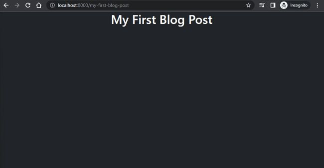
Finally, we have the <h1> element, which takes the title of your blog post from the frontmatter and center aligns it using the text-center class. Saving the file at this point, and returning to your browser, should display the following:

Next, we'll add in the banner image from your frontmatter to display above the header element of your web page. With the use of GatsbyImage and getImage from gatsby-image-plugin, we'll be able to fetch the image in multiple sizes and formats with only a few lines of code!
The Gatsby Image plugin is incredibly powerful, with many different features to help deliver the image exactly how you see fit. Gatsby's documentation on this plugin is very helpful, so I would recommend reading through it to better understand all that you can do with this plugin. We'll add our <GatsbyImage> element directly above our prior <h1> element:
<Col md={6}>
	{post.frontmatter.banner &&
		<GatsbyImage
			image={getImage(post.frontmatter.banner)}
			alt="Banner Image" />
	}
	<h1 className="text-center">
		{post.frontmatter.title}
	</h1>
</Col>
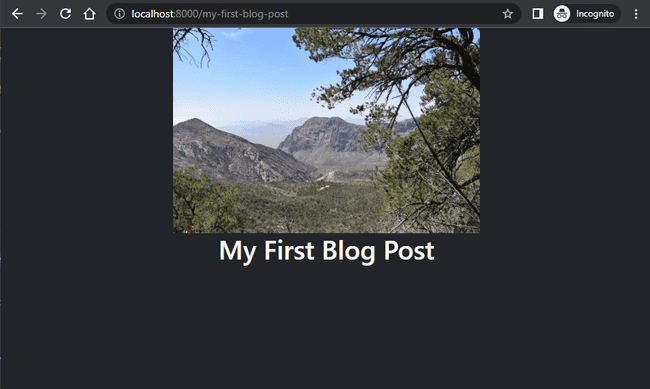
We first check to verify your frontmatter has a banner image stored in the data layer. If one is found, only then will it try to render an image component on your page. As your local dev site is built and cached the first time you run your server, you may need to clean your Gatsby build so that it can find this new image to display on your web page.
If you return to the browser, and the image only appears as the blurred placeholder, return to your terminal and stop the server with ctrl+c. Run npm run clean to remove the prior build files and then restart your server with npm run develop. After the server starts, refreshing your localhost web page should display a page similar to the following:

All that's left now is adding in the necessary code to display the rest of your blog post content onto the page. The below code snippet will display our dateCreated field, the dateEdited (if it does not equal dateCreated), our timeToRead field, as well as the remaining content of our blog post outside of the frontmatter:
<Row className="text-center">
	<Col xs={12}>
		<small>Created on {post.frontmatter.dateCreated}</small>
	</Col>
	{post.frontmatter.dateCreated !== post.frontmatter.dateEdited &&
		<Col xs={12}>
			<small><em>Updated on {post.frontmatter.dateEdited}</em></small>
		</Col>
	}
	<Col xs={12}>
		<small>{post.timeToRead} min read</small>
	</Col>
</Row>
<hr />
<div
	dangerouslySetInnerHTML={{ __html: post.html }}
/>
This code will be placed directly after the </h1> closing tag from the previous code block but before the </Col> closing tag. All of the text within the <Row> component will be centered within their parent element with the use of className="text-center". Also, each <Col> component has been set to the entire width of the parent element by setting xs={12}. The text here is being placed into a <small> HTML component to reduce the text size and allow for the title and body of the post to stand out. After the <Row> component, we add in a horizontal rule with the use of the <hr /> element to provide a clean line break between the metadata and the content of the post.
To add in our Markdown content, we use the dangerouslySetInnerHTML property of a <div> element. This lets React know that the HTML inside of this component is not something to care about, as it is content that you have created yourself. There's also performance gains to be had with this property as React will bypass checking the children of that node as it knows the HTML is coming from another source. With the use of this property, we can safely pass in our formatted HTML content and allow React to display it properly on the page, without any additional formatting needed in our code.
You must exercise caution when using this property though, particularly for anything that might allow for user input. Using this type of property on something like a comment field, without any sanitization of the data being passed into it, will allow for users of your site to enter in a script that can do anything from locking out a different users browser, installing cookies, or even wiping data from your data layer. As we're only passing in our own content to this <div> though, we can feel safe in using this property. If you would like to know more, you can find information about the dangerouslySetInnerHTML property on the ReactJs website, including a link to more information on cross-site scripting (XSS) attacks.
We have now finished setting up the basic structure and design of your blog post pages! Putting it all together from this and my previous articles, your code in "blog-post.js" should look similar to the following:
import React from "react"
import PropTypes from "prop-types"
import { graphql } from "gatsby"
import { Container, Row, Col } from "react-bootstrap"
import { GatsbyImage, getImage } from "gatsby-plugin-image";

const BlogPost = ({ data }) => {
  const { markdownRemark: post } = data

  return (
    <Container fluid className="min-vh-100 text-bg-dark">
      <Row className="justify-content-center">
        <Col md={6}>
          {post.frontmatter.banner &&
            <GatsbyImage
              image={getImage(post.frontmatter.banner)}
              alt="Banner Image" />
          }
          <h1 className="text-center">{post.frontmatter.title}</h1>
          <Row className="text-center">
            <Col xs={12}>
              <small>Created on {post.frontmatter.dateCreated}</small>
            </Col>
            {post.frontmatter.dateCreated !== post.frontmatter.dateEdited &&
              <Col xs={12}>
                <small><em>Updated on {post.frontmatter.dateEdited}</em></small>
              </Col>
            }
            <Col xs={12}>
              <small>{post.timeToRead} min read</small>
            </Col>
          </Row>
          <hr />
          <div
            dangerouslySetInnerHTML={{ __html: post.html }}
          />
        </Col>
      </Row>
    </Container>
  )
}

BlogPost.propTypes = {
  data: PropTypes.shape({
    markdownRemark: PropTypes.shape({
      frontmatter: PropTypes.shape({
        dateCreated: PropTypes.string.isRequired,
        dateEdited: PropTypes.string.isRequired,
        path: PropTypes.string.isRequired,
        title: PropTypes.string.isRequired,
        description: PropTypes.string.isRequired,
        banner: PropTypes.object,
      }).isRequired,
      timeToRead: PropTypes.number.isRequired,
      html: PropTypes.string.isRequired,
    }).isRequired,
  }).isRequired,
}

export default BlogPost

export const pageQuery = graphql`
  query BlogPostByPath($path: String!) {
    markdownRemark(frontmatter: {path: {eq: $path}}) {
      frontmatter {
        dateCreated(formatString: "MMMM DD, YYYY")
        dateEdited(formatString: "MMMM DD, YYYY")
        path
        title
        description
        banner {
          childImageSharp {
            gatsbyImageData(
              layout: FULL_WIDTH,
              placeholder: BLURRED
            )
          }
        }
      }
      timeToRead
      html
    }
  }
`
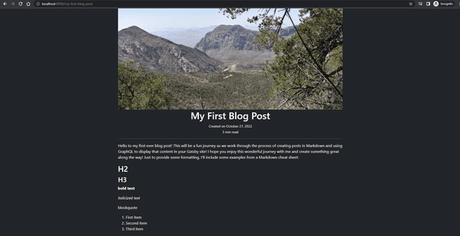
From just the above block of code, you will now be able to view pages for each Markdown file you have saved within the "posts" folder of your codebase! Depending on the content of your own Markdown file, your page should now look something similar to the following:

Now that you have the "blog-post.js" file set up, any time you merge a PR into your main branch with an added or updated Markdown file in your "posts" folder, Netlify will kick off a new deployment to your production site. After the build is complete, you'll be able to navigate to your site in a browser and see the changes you made!
I hope you enjoyed this series on How to Build a Gatsby Blog! All that's left to do now is to add in your own personal flair to the design of the blog pages. This can be done by continuing to utilize the pre-built Bootstrap styles, or creating your own CSS file and importing those styles into "blog-post.js". Regardless of what you choose though, I have confidence that it will look great, as it will be an extension of who you are as a person. Best of luck with the design of your blog page and I look forward to seeing the finished product! Please let me know about it in the comments below and I would be more than happy to take a look at it and see what you've come up with! The links to my social media accounts can be found on the contact page of my website. Please feel free to also share any of your own experiences on working with Gatsby, general questions and comments, or even other topics you would like me to write about. Thank you and I look forward to hearing from you!👋